
Care Home Branding & Design Case Study
The Hollies
Littlecombe Park
Luxury, community focused, family-run care centre
The Challenge
The Hollies Care Centre needed a new brand architecture and visual identity as the business planned to increase services and double its capacity. In such a competitive market place the branding needed to stand out against its competition and communicate its strengths.
Objective
To create a brand framework that provides a platform for growth and engages with the target audience (residents and families), health professionals and employees in a way that truly represents the values held at the care centre and its owners.
Our approach
Research > Vision > Positioning > Brand architecture > Visual identity > Roll out
Branding
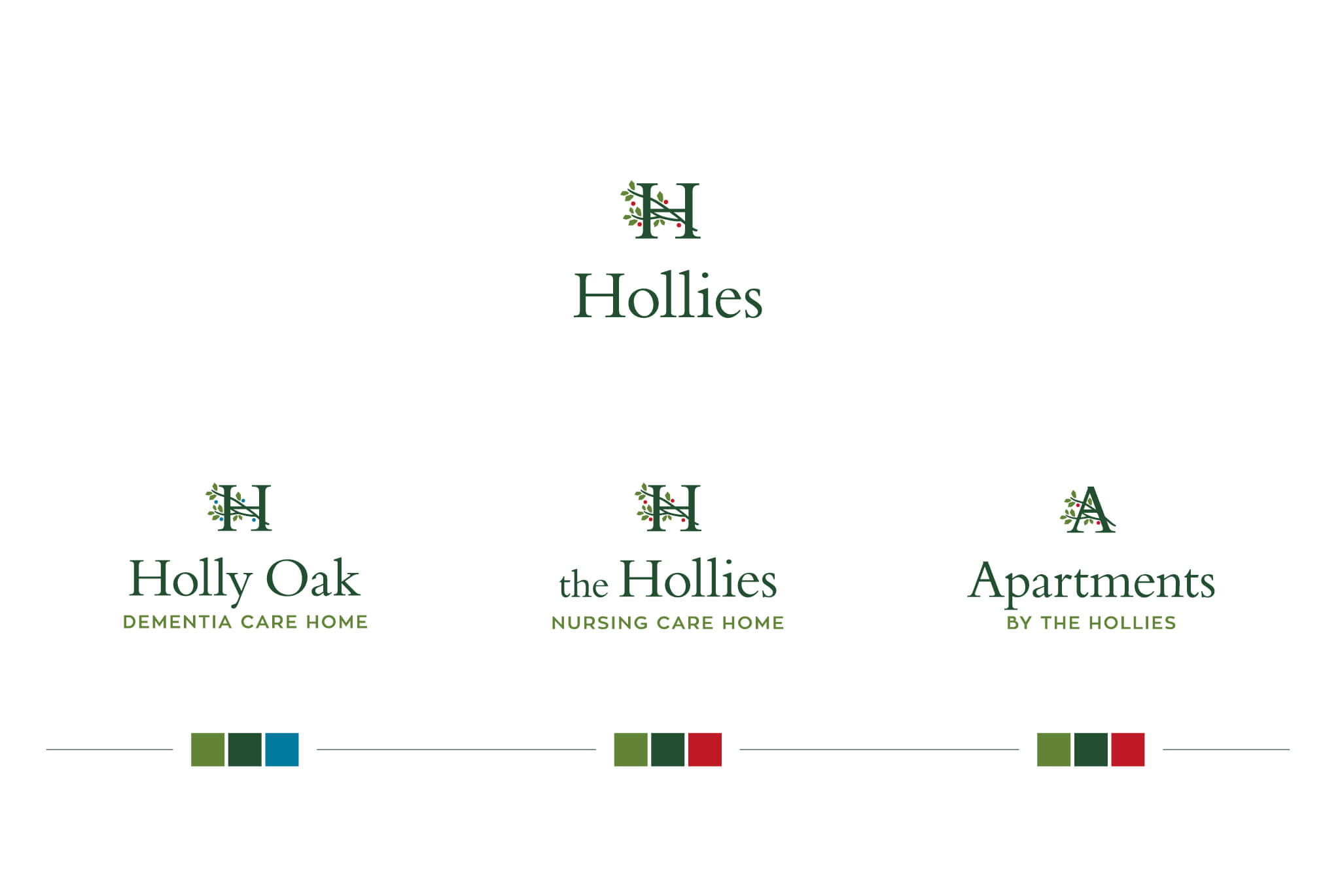
Research was conducted with all stakeholders which led to clarity of the brand vision and values along with a distinct positioning. The brand architecture was established and visual identity developed based around the Hollies, the renowned name for the centre. Aspirational branding with a warm colour palette and bespoke photography ensures a vibrant and positive tone.
Rollout
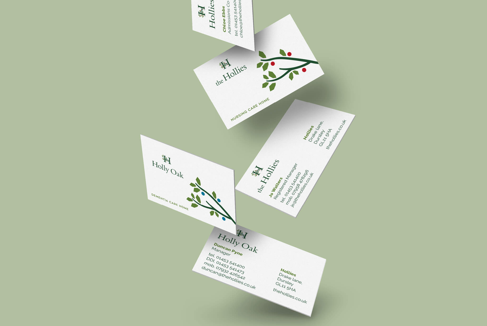
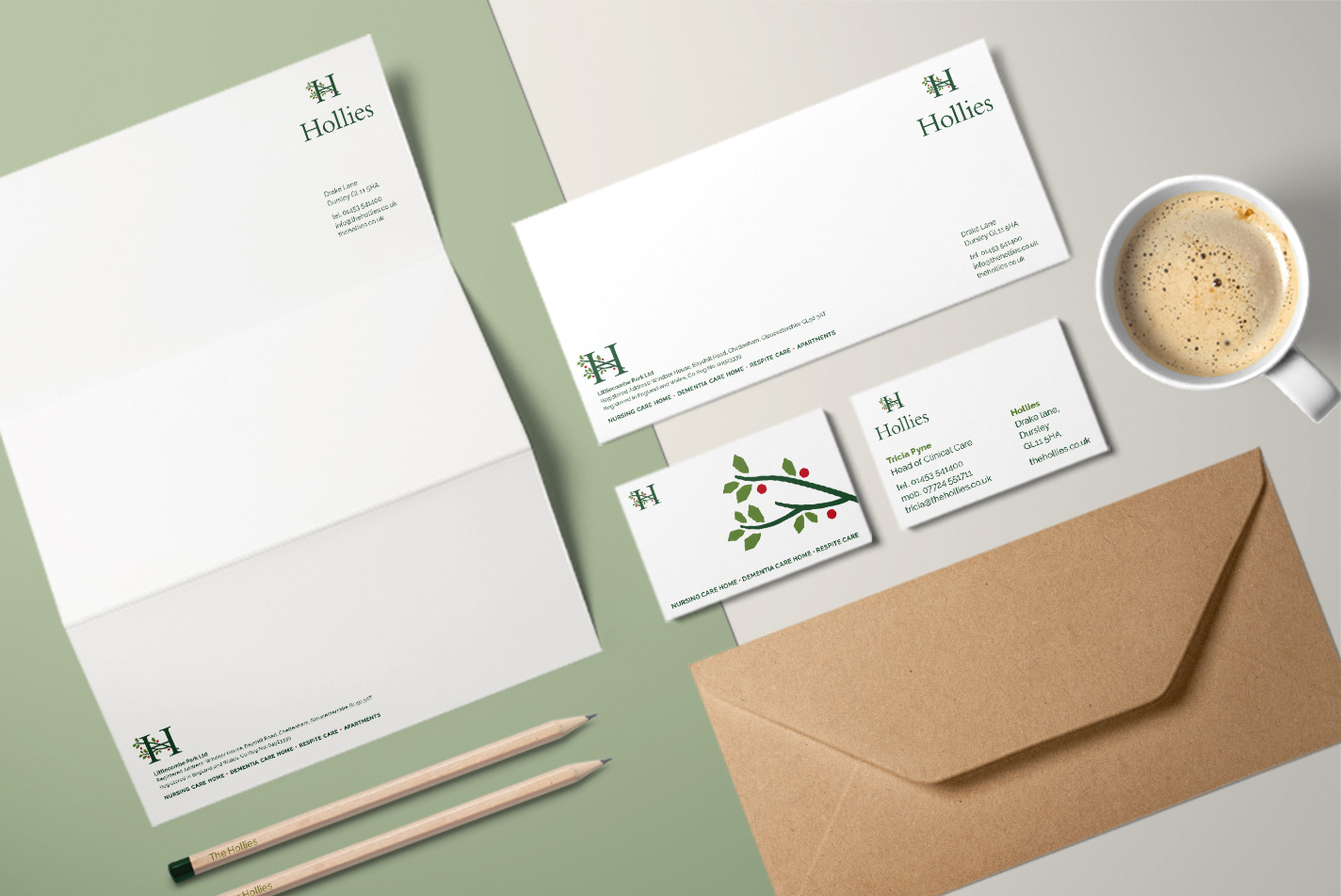
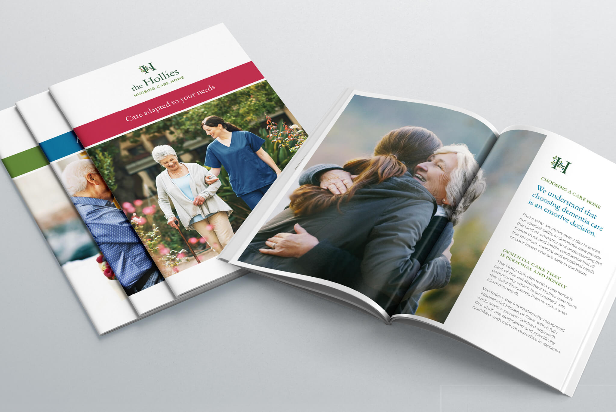
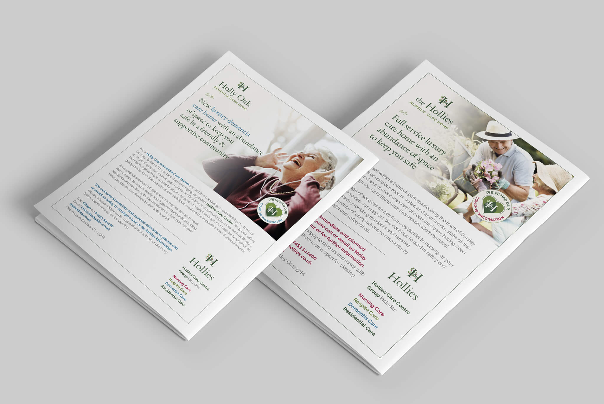
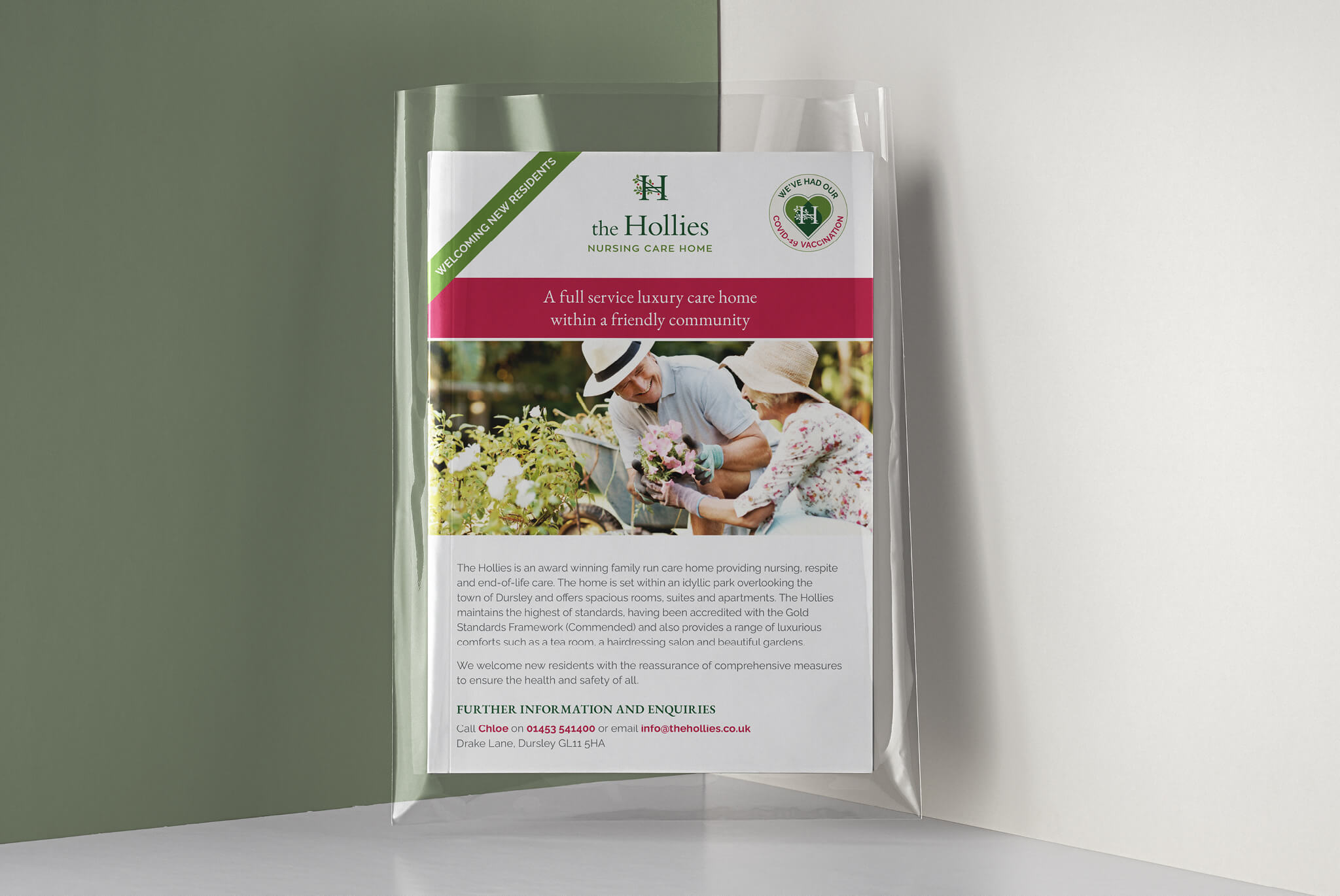
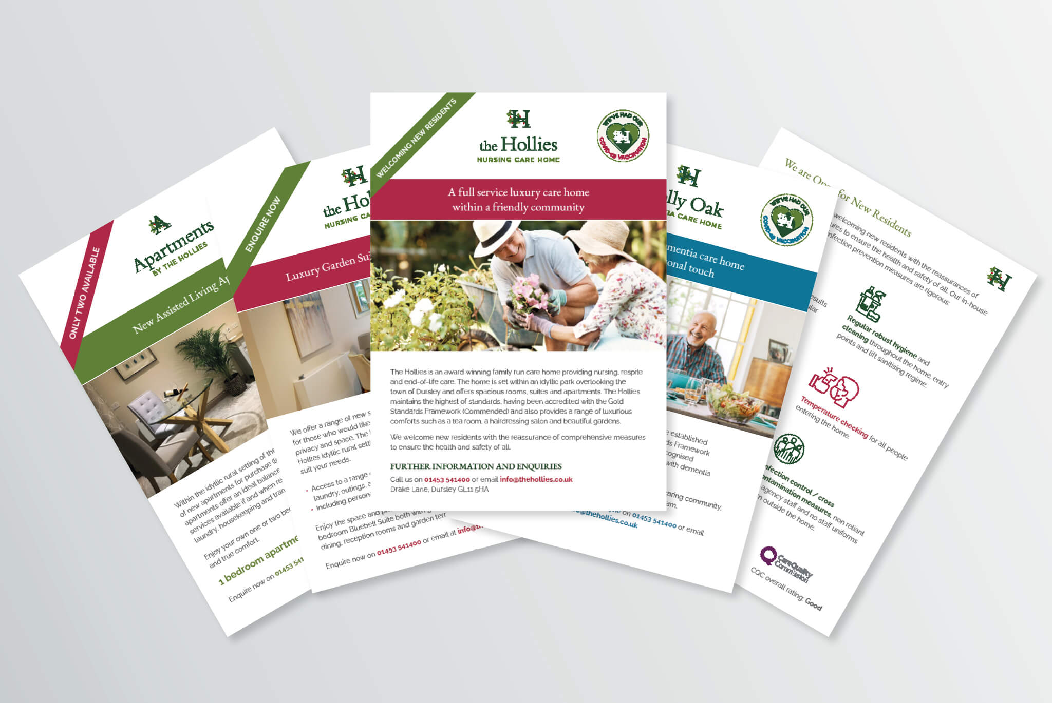
Brand assets and fresh communications throughout were created. On site this included wall graphics, floor etching, signage, vehicle livery, name badges and menus. A distinctive website with fresh imagery was designed with straight forward user experience. Consistently branded brochures, flyers, sponsorship and brand advertising have built a wider brand awareness, recognition and loyalty; whilst door drops, social media activity and tactical advertising continue to drive high enquiry levels and conversion. IM London continues to provide a brand guardianship role as well as ongoing marketing consultancy and services to support the growth of the business.